

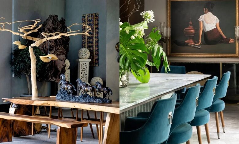
Walking into a professionally designed home evokes an immediate sense of ease and visual harmony. Every element seems to belong, every surface tells a story, and the balance between comfort and sophistication appears effortless. For many homeowners, recreating that feeling proves frustrating. You can purchase beautiful furniture, select high-end paints, and collect tasteful accessories, yet the finished space can still feel disconnected or resemble a commercial showroom rather than a curated home.
The difference lies in styling. While interior architecture and furniture sourcing lay the structural groundwork, styling brings a room to life. Professional interior designers rely on an arsenal of subtle rules, spatial formulas, and optical tricks to bridge the gap between functional layout and elevated design. Mastering these foundational techniques allows anyone to transform a generic living space into an intentional, character-rich sanctuary.
The Power of Scale, Proportion, and Negative Space
One of the most common mistakes amateur decorators make is filling a room with pieces of identical size and visual weight. When every object demands equal attention, the human eye cannot determine where to look, resulting in visual fatigue.
Playing with Varied Heights
A dynamic interior operates on multiple vertical planes. Designers visualize a room as a landscape with peaks and valleys:
-
Vertical Contrast: If a sofa sits low with horizontal lines, designers balance it with a soaring arched floor lamp, a tall vertical mirror, or floor-to-ceiling drapery panels.
-
Tabletop Landscapes: When styling credenzas or console tables, professionals pair tall elements like ceramic urns or leafy branches with medium-height items like stacked art books, finishing with low-profile pieces such as shallow stone catchall bowls.
-
Wall Sightlines: Hanging framed artwork too high detaches the art from surrounding furniture. Designers align the center point of framed pieces roughly fifty-seven to sixty inches from the floor, anchoring the visual plane directly at standard eye level.
Embracing Intentional Negative Space
Overdecorating suffocates a room. Professional styling relies heavily on negative space, the empty areas left intentionally blank to give the eyes room to rest:
-
Breathing Room on Shelves: A bookshelf should never be packed from edge to edge with paperbacks. Leaving empty space around a single sculptural vessel highlights its craftsmanship far better than surrounding it with clutter.
-
Floor Margins: Floating furniture away from perimeter walls rather than pushing sofas flat against baseboards creates depth, allowing light and air to move naturally through the room.
Layering Textures and Mixed Materials
A monochromatic or neutral color scheme looks flat and uninspiring when executed in a single finish. Designers use tactile friction to make quiet palettes feel luxurious, layering diverse materials against one another to create visual richness without relying on loud colors.
The Tactile Rule of Three
An expertly styled seating area incorporates at least three contrasting textures within a single zone:
-
Matte Against Gloss: Place a glazed, reflective ceramic vase on a matte, wire-brushed oak coffee table, or set polished marble coasters on a textured linen surface.
-
Soft Against Rough: Balance a smooth, tailored velvet armchair with a chunky bouclé throw pillow, setting both on an earthy woven jute or sisal area rug.
-
Warm Against Cool: Pair cool, industrial metals like blackened steel or polished chrome with warm organic elements like tanned saddle leather, terracotta pottery, and natural live-edge wood.
Curating a Purposeful Metal Mix
Matching every metal finish throughout a room makes a home feel like a corporate showroom. Designers intentionally mix two to three metal finishes within a shared space to evoke an established, collected atmosphere. The secret is selecting one dominant metal that covers roughly sixty to seventy percent of the fixtures, such as aged unlacquered brass, and contrasting it with a complementary secondary metal, like matte black iron or brushed nickel, distributed across lamps, cabinet pulls, and side table legs.
Layering Light Beyond Overhead Fixtures
Overhead recessed can lighting or single ceiling fixtures flatten a room, casting harsh downward shadows that wash out textures. Professional designers treat lighting as a sculptural, layered element rather than a purely utilitarian requirement.
The Three Tiers of Lighting
A well-composed room requires three distinct light sources working in harmony:
-
Ambient Lighting: The general illumination of the room, typically provided by hidden cove lighting, flush-mount fixtures, or softened wall sconces bouncing light off ceilings.
-
Task Lighting: Focused illumination directed at functional activities, including articulated reading lamps beside armchairs, under-cabinet strips in kitchens, and targeted desk lamps.
-
Accent Lighting: Directional light used to highlight specific architectural features, such as picture lights mounted directly above oil paintings or uplights tucked behind large indoor trees to cast dramatic ceiling shadows.
The Golden Temperature Rule
Bulb temperature dictates the mood of a room. Designers avoid harsh blue or cold white daylight bulbs in residential living areas. Standardizing indoor lighting between 2700K and 3000K produces a warm, candlelit glow that softens paint undertones, flatters skin tones, and creates an inviting evening ambiance. Adding wall dimmers to every hardwired fixture gives you complete control over spatial atmosphere.
Mastering Vignettes and Surface Styling
A vignette is a small, curated grouping of decorative objects arranged to tell a visual story on a flat surface, such as a coffee table, fireplace mantel, or entry console. When built correctly, vignettes reflect the personality and lifestyle of the home’s occupants.
The Magic of Asymmetry and Odd Numbers
The human brain instinctively seeks symmetry, which can make perfectly matched displays feel rigid. Designers use odd numbers and asymmetric balance to introduce natural energy:
-
The Rule of Threes: Grouping decorative pieces in clusters of three or five creates a dynamic, triangle-shaped configuration where the eye moves fluidly between elements.
-
Off-Center Focal Points: Instead of placing a large mirror directly in the middle of a mantle, designers often shift it slightly to one side, balancing the opposite end with a taller floral arrangement or a pair of leaning framed prints.
The Foundation of Stacked Coffee Table Books
Books serve as the ultimate design tool because they introduce color, typography, personal interests, and structural elevation:
-
Building Pedestals: Stacking two or three oversized hardcovers turns ordinary books into a display pedestal for smaller decorative objects, such as brass magnifying glasses, geological crystals, or carved marble bowls.
-
Palette Alignment: Removing glossy paper dust jackets often reveals stunning linen-bound or cloth-wrapped hardcovers in muted, elegant tones that blend with the room.
Bringing the Outdoors Inside with Large-Scale Greenery
Small, artificial plants scattered across end tables quickly look like an afterthought. Professional designers use scale when introducing organic life, relying on substantial botanicals to soften rigid architectural lines.
-
Oversized Branches: Instead of compact, tightly arranged floral bouquets, designers place tall, dramatic tree cuttings like olive, eucalyptus, or cherry blossom branches inside massive stoneware jugs. The sweeping natural reach of these branches draws the eye upward toward the ceiling.
-
Statement Foliage: A single mature indoor specimen, such as a fiddle-leaf fig, an olive tree, or a broad-leaf bird of paradise seated inside a substantial textured planter, establishes an immediate living focal point that animates empty room corners.
The Curated Collector Approach
The most captivating interiors feel assembled over decades rather than purchased in a single weekend. Incorporating vintage, handcrafted, and heirloom pieces injects soul into a room, preventing new builds from feeling sterile.
-
Mixing Eras: Pairing a mid-century modern credenza with a traditional gilt-framed oil painting creates compelling visual tension. The contrast allows each era to complement the other.
-
Patina and Imperfection: The Japanese concept of wabi-sabi, finding beauty in imperfection, is central to elevated design. A weathered wooden stool, an oxidized bronze bowl, or an antique Persian runner bearing faded patterns introduces a sense of history and permanence that no factory-fresh piece can replicate.
Styling is a deliberate practice that turns a collection of furniture into a cohesive home. By balancing scale, giving negative space room to breathe, layering rich textures, controlling the temperature of your lighting, and mixing antique charm with modern clean lines, you can apply professional design principles to build a comfortable, layered, and visually captivating home.
Frequently Asked Questions
How do you determine the correct area rug size for a living room?
The most common mistake is purchasing an area rug that is too small, which makes the entire room feel cramped. A properly sized living room rug should be large enough that at least the front two legs of all primary seating furniture rest comfortably on top of it. In larger spaces, an ideal layout allows all four legs of every seating piece to sit within the rug perimeter, leaving roughly ten to eighteen inches of bare flooring exposed around the room edges.
What is the best technique for styling open kitchen shelves without making them look cluttered?
Keep open kitchen shelving functional and unified by focusing on items you use daily. Stick to a tight, monochromatic palette, such as matte white ceramic dishes, clear glassware, and natural wood cutting boards. Group similar items in sets of three or four, and intersperse everyday dish stacks with a single small potted herb or a small framed landscape print to balance utility with beauty.
How should window treatments be hung to make ceilings look taller?
Hang drapery rods close to the ceiling line, roughly two to four inches below the crown molding or ceiling trim, rather than directly above the window casing. Mount the rod brackets six to twelve inches wider than the window frame on each side. This allows drapery panels to hang clear of the window glass when open, letting maximum natural light enter while tricking the eye into believing the ceiling is feet higher than its actual height.
How do you select throw pillow combinations that look professional rather than chaotic?
Create a cohesive look by combining three different pillow sizes and pattern scales that share a single underlying thread of color. Start with two large, solid or heavily textured twenty-two-inch pillows in the back corners. Layer two medium twenty-inch pillows featuring a medium-scale geometric or floral pattern in front, and finish the arrangement with a single textured lumbar pillow displaying a small-scale stripe or micro-print in the center.
What is the easiest way to hide unsightly electronics and cords in a styled space?
Run television cables through in-wall cord concealment kits or paintable surface raceways that match your wall color. Place wireless routers and surge protectors inside decorative woven lidded baskets with small holes cut into the rear weave for cables. When styling electronics on consoles, frame them with tall plants, stack books beside them, or use a sculptural wood bowl to draw the eye away from screens.
How do you know when a styled room has too many decorative accessories?
Use the editorial pause technique: step back and take a photograph of the styled area with your phone. Viewing a three-dimensional space on a flat screen flattens perspective and instantly reveals visual clutter, awkward proportions, or crowded shelves. If your eye cannot comfortably land on a single focal element within two seconds, remove twenty percent of the accessories, prioritizing the removal of smaller, non-functional knickknacks.
Why do designers prefer matte and eggshell paint sheens over satin or semi-gloss for living areas?
Matte and low-sheen eggshell paints absorb light rather than reflecting it, creating a soft, velvety appearance that conceals drywall bumps, uneven framing, and wall surface imperfections. High-gloss and semi-gloss paints bounce light sharply, highlighting every scratch, ding, and roller lap mark, which is why designers reserve glossier finishes exclusively for trim, doors, and millwork.


